It is important to keep updated with everything that’s going on, right? Here at Volumio we believe refresh is always good, this is why we are thrilled to announce the new Volumio’s User Interface update. We are always working to keep Volumio updated, fresh and of course, with a good-looking design where you can easily know your way around. The principles we follow for the new version of Volumio is to maintain the concept and attributes that defines Volumio and adding the features we believe can be of great use from existing music players, in order to improve our core and give the user more flexibility.
This updated Volumio version, or what we like to call it, the Contemporary Volumio UI is released with an elegant design, both for the desktop and mobile version, that will give the users a more clean and organized layout. We’ve been working these past few month to improve the main concept of Volumio in this new version, giving the user an easy-to-use software. Many thanks to Christopher, Bence, Agnes, John and Jackie for the awesome contribution, this UI is the result of their joint effort.
Let see how the Contemporary Volumio User Interface looks like:
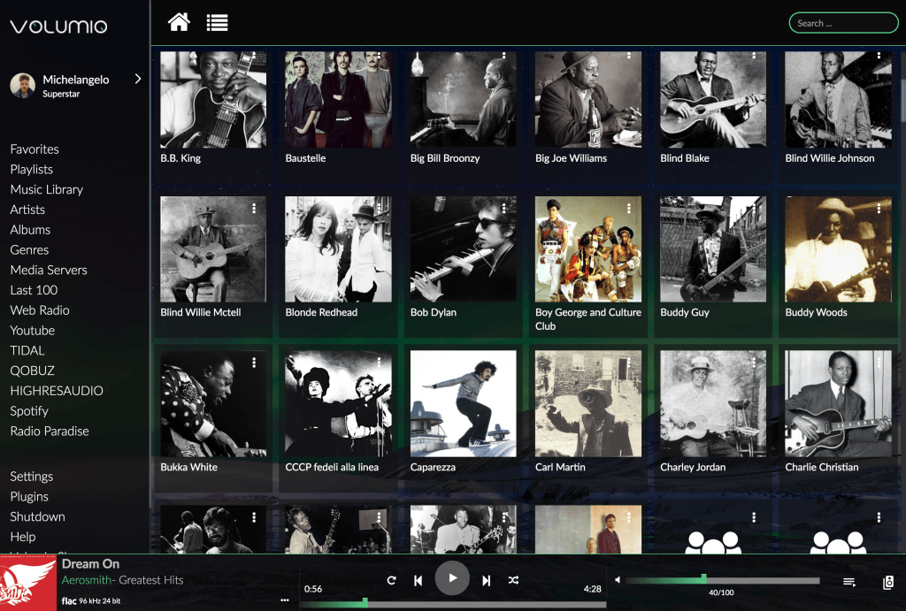
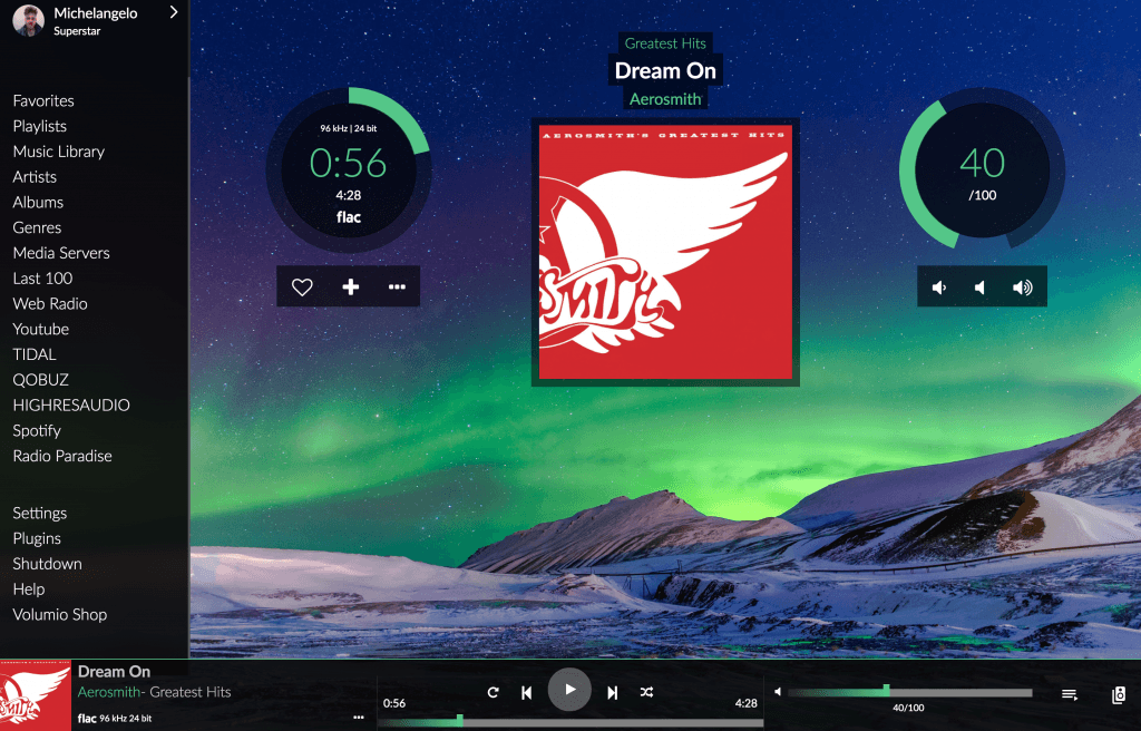
The bottom bar is the main feature of the new version, while browsing through every page on your Volumio, you can see the current audio playing and control it from there without having to go to the main page.
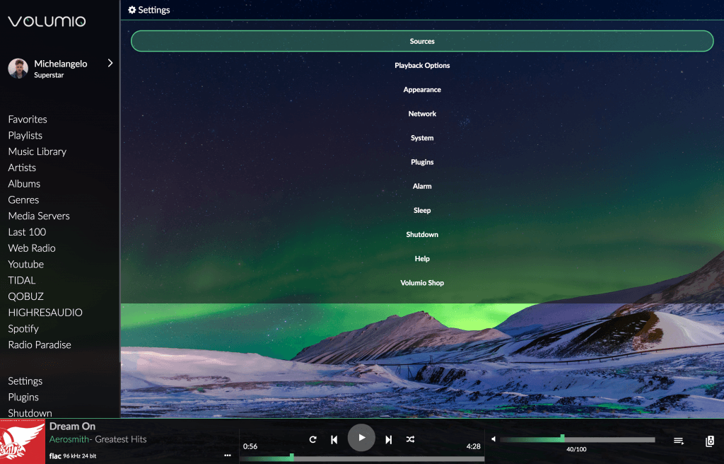
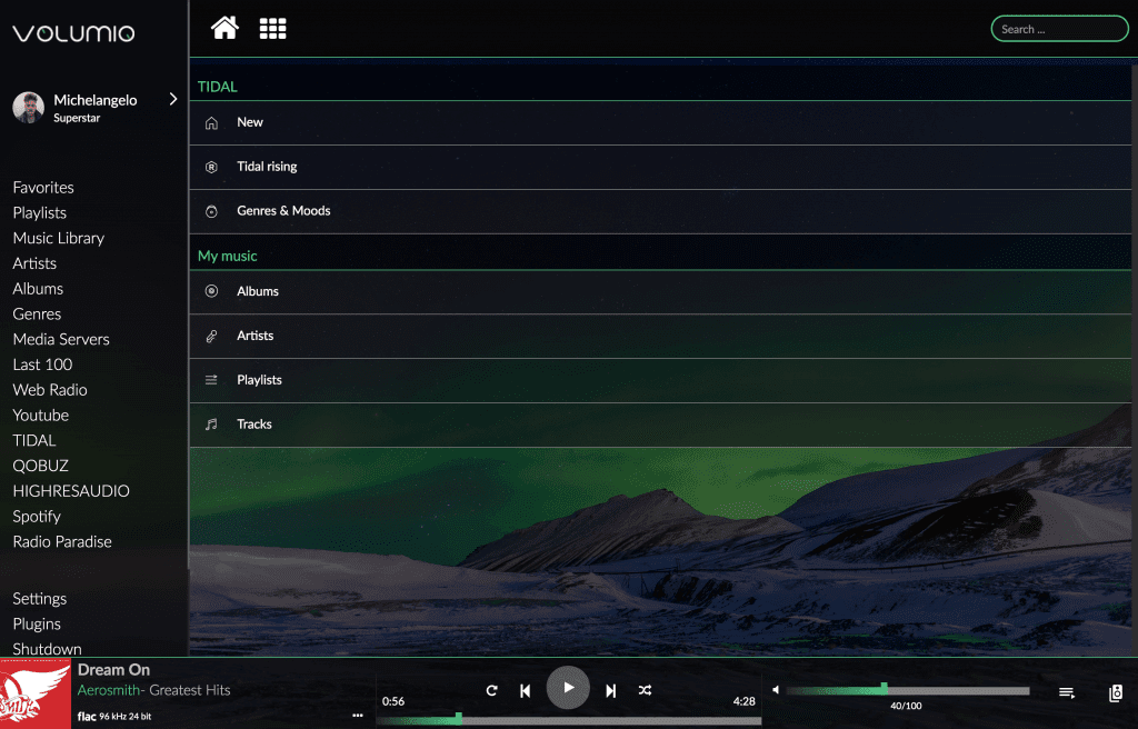
The new design is simple and clean, giving your Volumio a more organized design while browsing through the menu.
The left menu can display the integrations or plug-ins you use, becoming an easier way to access it.
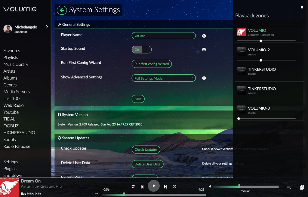
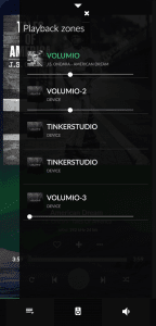
In the playback zone column bar, you can easily change and control the devices in just one click.
Keeping the existing structure of the classic Volumio version but adding a few features to keep it an easy-to-use and intuitive design.
And now let’s take a look at the mobile version…
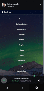
Bottom bar available while browsing in your music library
Clean look while going through the menu
Elegant design on the playback page
And the playback zones view…
How do you like it so far?
This new version is available to ALL Volumio users. It’s free for all, just update it and you’ll get it right away.
To enable the Contemporary version of Volumio It’s super easy, just update to the latest version (Volumio 2.712) and by default the contemporary design will be applied on the UI.
Take a look around and see all the new perks of using the Contemporary Volumio UI, and if for whatever reason it does not work for you, do not worry because you can change back to the Classic version, just go on settings, appearance, and on the bottom of the page you can change the User Interface Layout Design.
Your opinion matter to us! Give us a feedback about it, we want to know what works for you, what doesn’t and needs to be improved. Just let us know here in the comments!
And last but not least, be on the lookout for more news, we are currently working on new features and improvement so prepare for more surprises, this new update is just a glimpse of all the things coming out soon!
Enjoy!


